We’re not going to be seeing anything more than a beta of One UI 7 in 2024, so if you were waiting to see Samsung’s take on Android 15 on your Galaxy smartphone this year, you’ve got to let that dream float away. One UI 7 is only going to be released fully when the S25 series launches.
However, us Samsung (and Android) lovers have been craving a least a taste of it way before that time comes. Fortunately, a YouTuber somehow got his hands on an S24 Ultra running on One UI 7, and thanks to him, we get a basic look at One UI 7 and some of the things that are going to change.
YouTube Mobile Wala Bhai Got His Hands On An S24 Ultra With One UI 7

One UI 7 is still pretty much a big mystery up until now. Samsung is expected to be painfully slow in pushing out its Android 15 update to its users, especially when you consider that Vivo, Motorola, Google, OnePlus, and Honor have already released their respective versions.
Of course, with that kind of delay on the books, people are hungry for whatever info they can get regarding One UI 7, and today, the YouTube Mobile Wala Bhai is the hero, as he somehow managed to get his hands on an engineering sample of the Galaxy S24 Ultra, running on One UI 7. That’s interesting.

The video is at risk of being taken down, so it’s a good idea to watch it as soon as you can. However, it is nice to get a serious look at some of the UI changes we can expect from One UI 7 will acquire. Let’s talk about some that I noticed.
Some Of The Icons Get A Redesign

Simply from paying attention to how delayed One UI 7 is going to be, it is clear that Samsung is preparing a pretty big overhaul to the operating system. A lot of Samsung’s icons are going to be revised to indicate that.

From the above screenshots, we can see that the Gallery, Camera, Settings, and Galaxy Store icons get updated in a pretty noticeable way. The search bar in the app drawer also shifts to the bottom of the screen instead of the top.
The Notification And Quick Settings Shades Have Been Separated
Your notifications and Quick Settings no longer share the same shade. You have to swipe down from the right side of the selfie camera to bring down the Quick Settings and from the left side to show your notifications.

However, the Quick Settings screen is very different. Each section now has corners that are significantly more rounded, your volume now shows in its own slider under the brightness, and your Quick Settings lose the text underneath each of them. I have to say, I sort of like it.

On the other hand, the part with your notifications will only have your notifications, which now come in pill-shaped containers instead of the rounded rectangles that they were before.
The Battery And Charging Icons Are Different Now
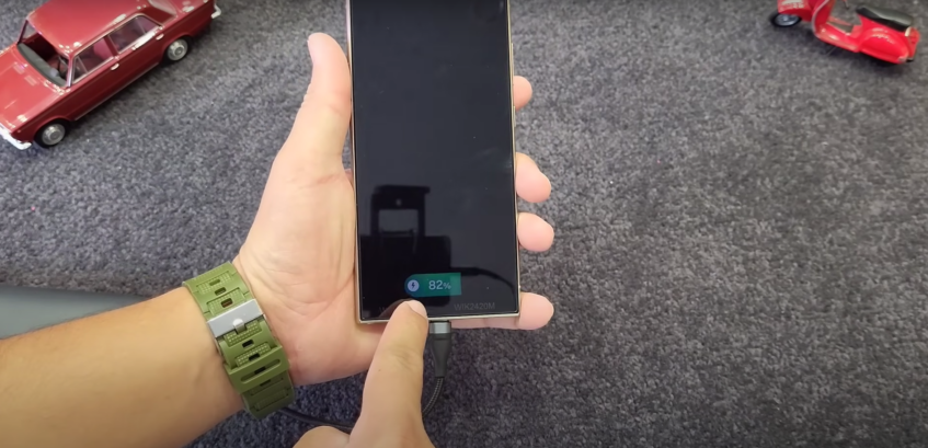
That’s not all there is to UI changes. When you plug in your locked device to charge, instead of seeing a giant circle show up in the center of the screen, you now get a relatively muted green pill showing up at the bottom of the screen. After a few seconds, it turns into a grey pill and stays that way while the device continues to charge.

When the device isn’t locked and you plug the phone in to charge, the battery icon in the top-right corner briefly enlarges and turns green in a smooth animation, before returning to a less obtrusive form.

This just seems to be the tip of the iceberg when it comes to the changes coming to One UI 7, and quite surprisingly, some of them have grown on me. I’m excited to give One UI 7 a test run for myself.


